The Paradox of Choice in Web Design
In consumer psychology, the 'Paradox of Choice' dictates that an abundance of options leads to cognitive overload, anxiety, and ultimately, decision paralysis. Unfortunately, the software industry has conditioned marketers to believe that 'more features equals more conversions.' When using dynamic page builders, the temptation to drag and drop dozens of interactive elements onto a landing page is overwhelming.
Marketers clutter their funnels with exit-intent popups, spinning discount wheels, fake 'recent purchase' notifications, scrolling marquees, and social media feeds. This feature-creep does not increase trust; it destroys the user's focus and severely degrades the conversion rate.
The Cost of Cognitive Overload
Every time you add a dynamic widget to your page, you are stealing from your prospect's limited mental bandwidth. When a potential buyer clicks your ad, they are highly skeptical and highly impatient. They are subconsciously asking two questions: What is this? and What do I do next?
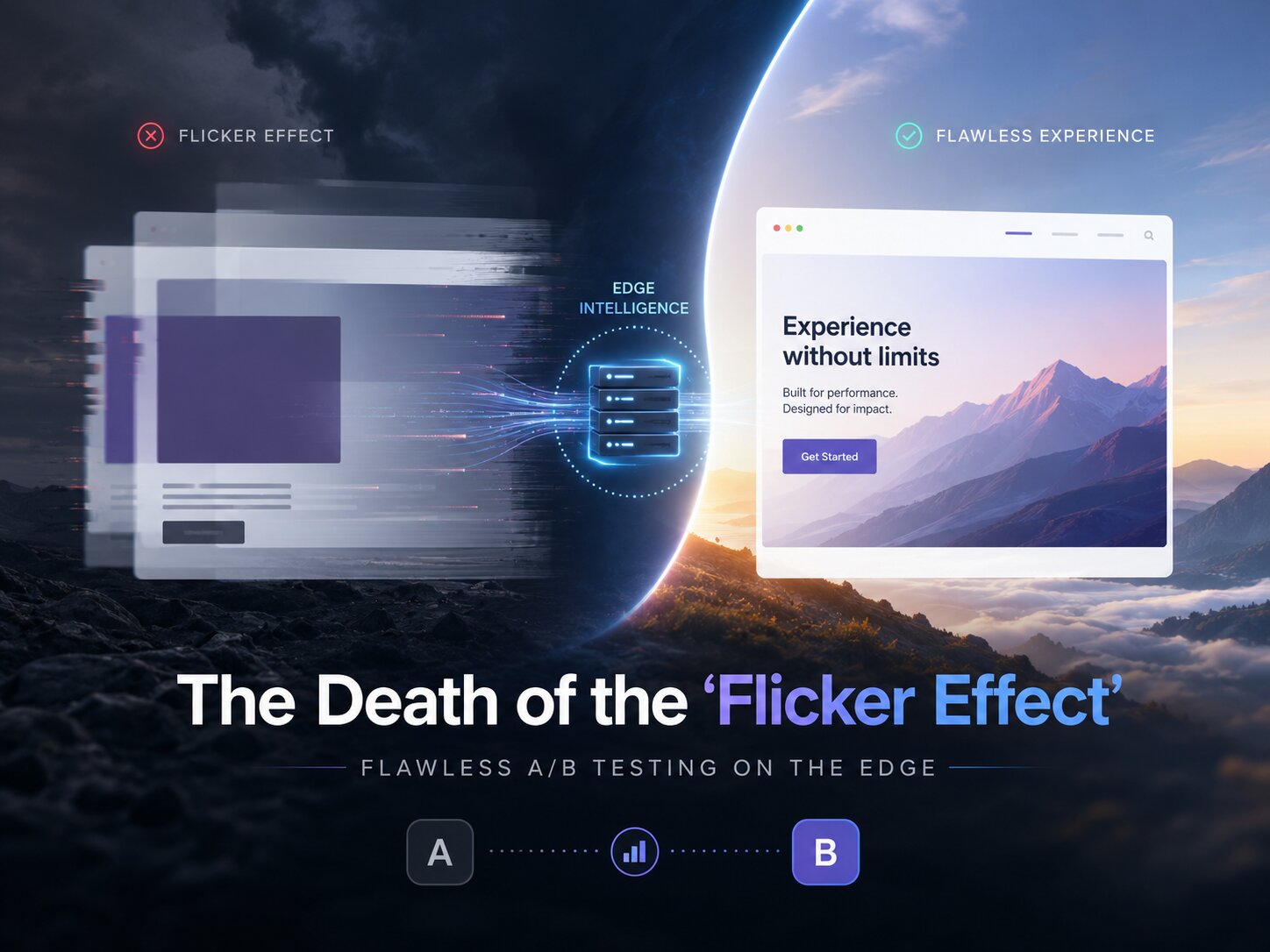
If they land on a page that immediately assaults them with a chat widget pinging on the right, a countdown timer flashing at the top, and social share buttons floating on the left, you trigger cognitive friction. Instead of reading your carefully crafted sales copy, their brain is busy processing visual noise. Furthermore, these dynamic elements rely heavily on bloated JavaScript, which frequently breaks or causes lag on mobile devices, where 70% of your traffic originates.
The Static Philosophy: Forcing Focus
Static Funnels naturally align with a minimalist conversion philosophy because the architecture itself discourages the integration of heavy, bloated third-party widgets. By removing the endless catalog of WordPress plugins, you are forced to focus on the only variables that actually matter: Offer, Copy, and Frictionless User Experience.
A highly optimized Static Funnel landing page is ruthlessly stripped down:
- The Hero Section: A razor-sharp headline, a fast-loading static image or vector graphic, and a clear subheadline. No distracting video backgrounds that kill load times.
- The Narrative Flow: Smooth, uninterrupted scrolling. No layout shifts or jarring animations. The user is effortlessly pulled down the page, consuming your sales argument line by line.
- The Singular Call to Action (CTA): There is only one exit from the page: the checkout or the opt-in form. No header navigation, no footer links to your blog, no social media icons. You offer a binary choice: convert or leave.
Invisible Technology, Maximum Impact
The highest achievement of marketing technology is to become completely invisible to the user. When a page loads instantly, remains visually stable, and presents zero distractions, the technology gets out of the way. Your prospect is left alone with your message.
Conclusion: Subtraction as a Strategy
At The Funnel Five, we don't sell gimmicks. We sell performance. By adopting a static architecture, you are actively choosing to remove the friction that kills sales. In the world of direct response marketing, clarity beats cleverness, and speed beats features. Strip away the noise, and watch your ROI multiply.